
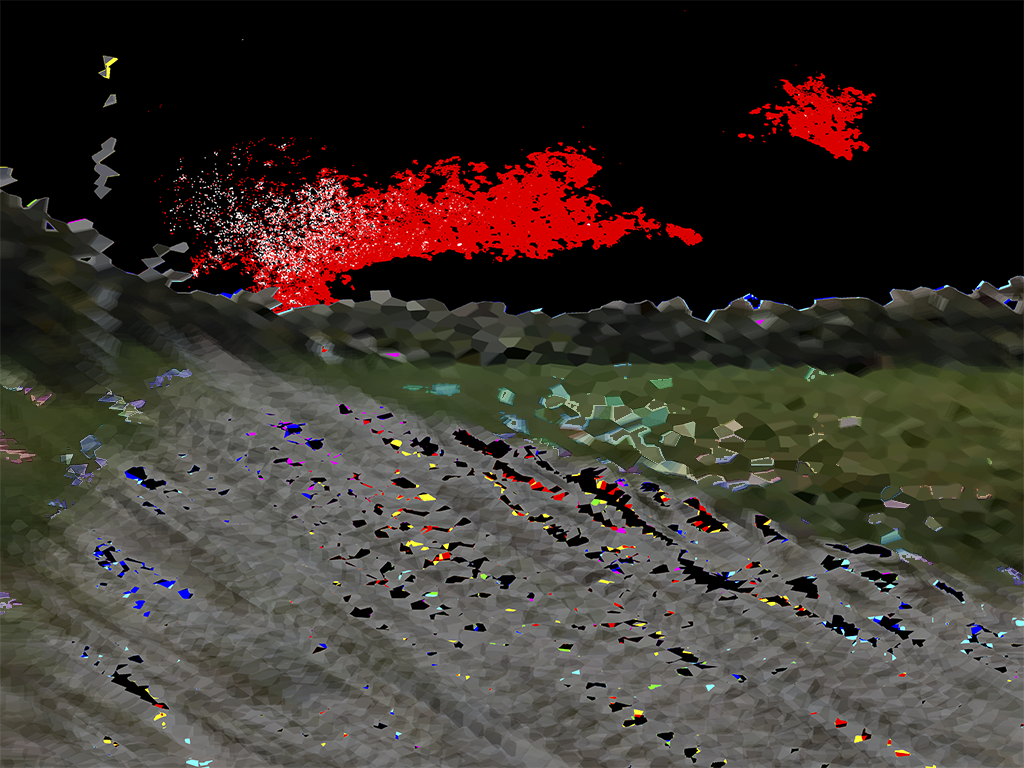
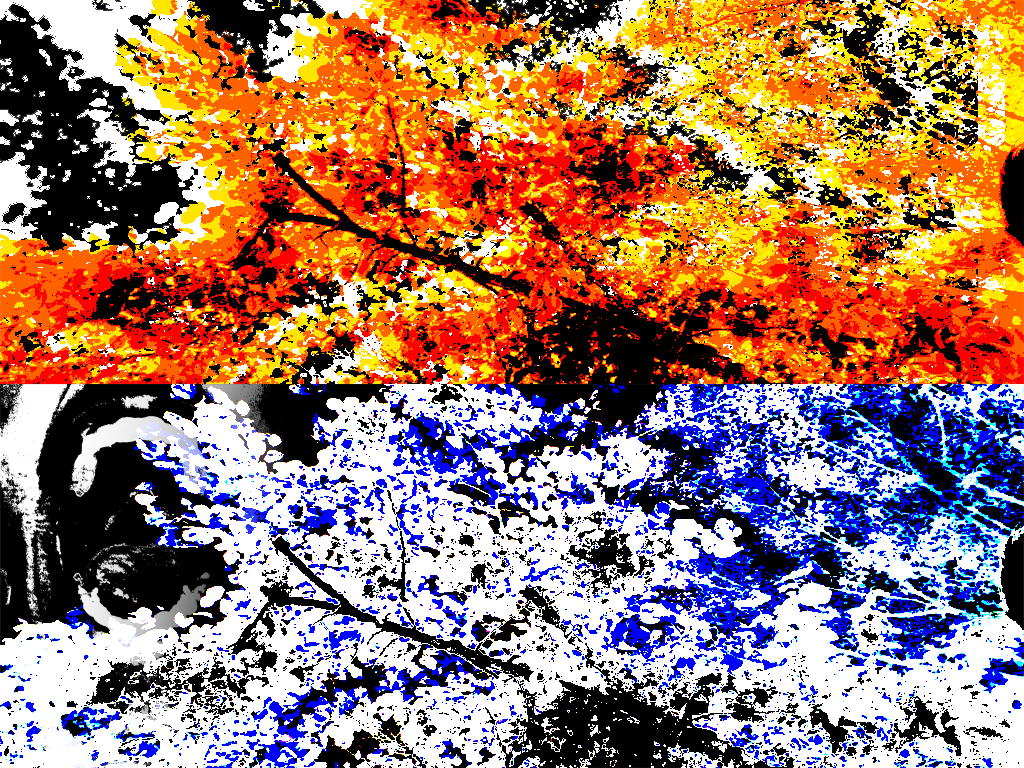
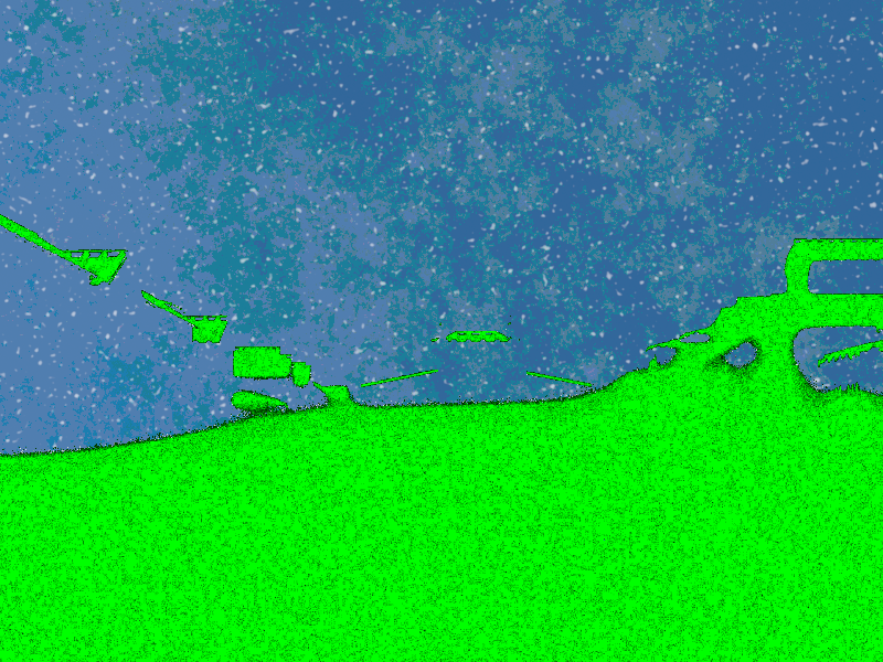
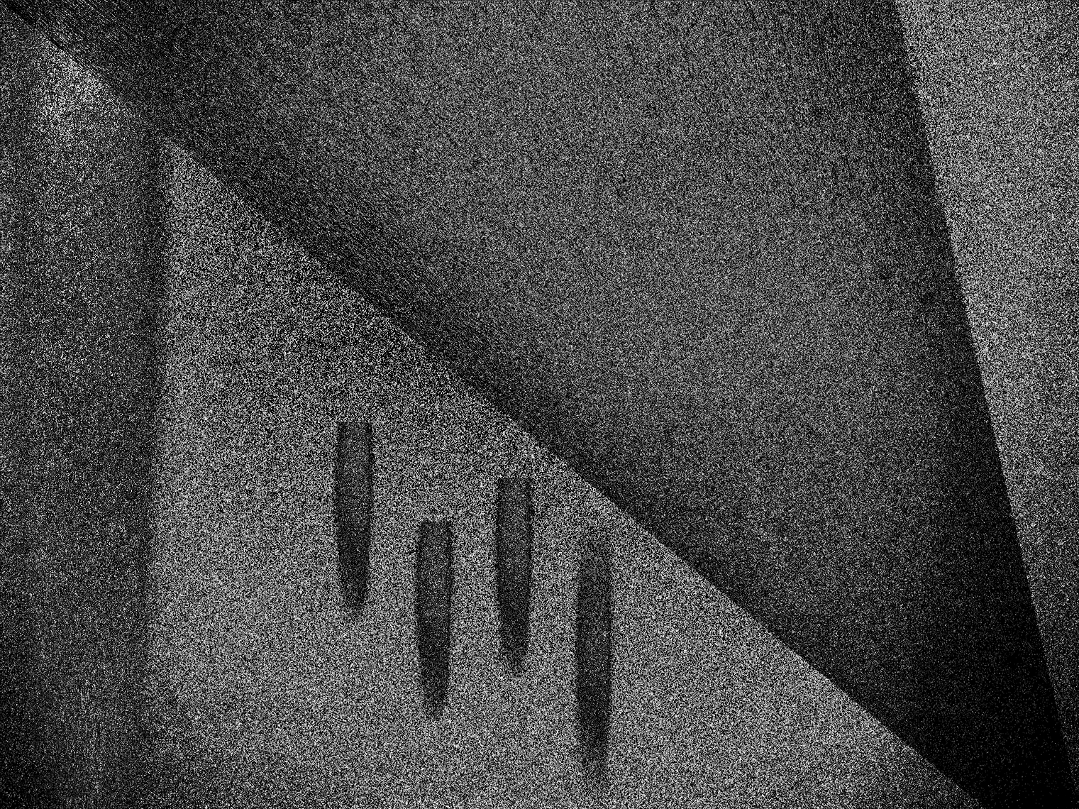
"Fédon"
The inspiration came from the book "Fedon" of Plato. I liked the way Socrates considered that our skies could be someone's ocean while our ocean could be someone's skies. This work, for me, is an interpretation of reality. I also split it in two, the horizon being the divider. Pretty cool no?

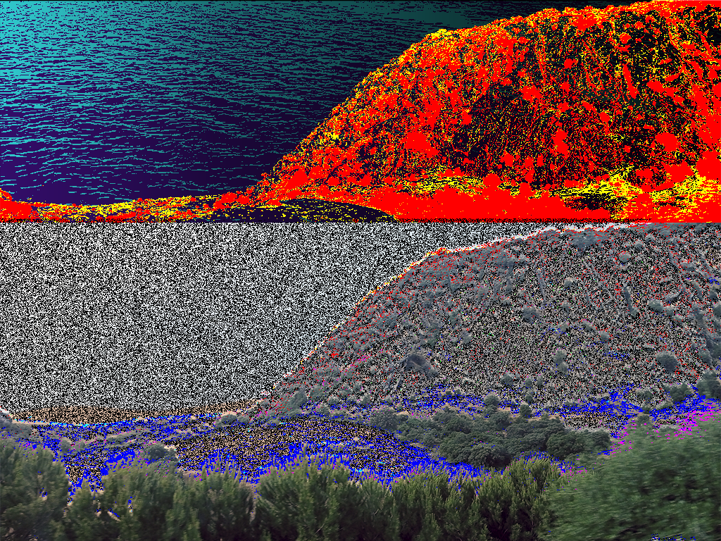
"Para mim, que solução há?" *(Translated into English, it means "For me, is there a solution?")
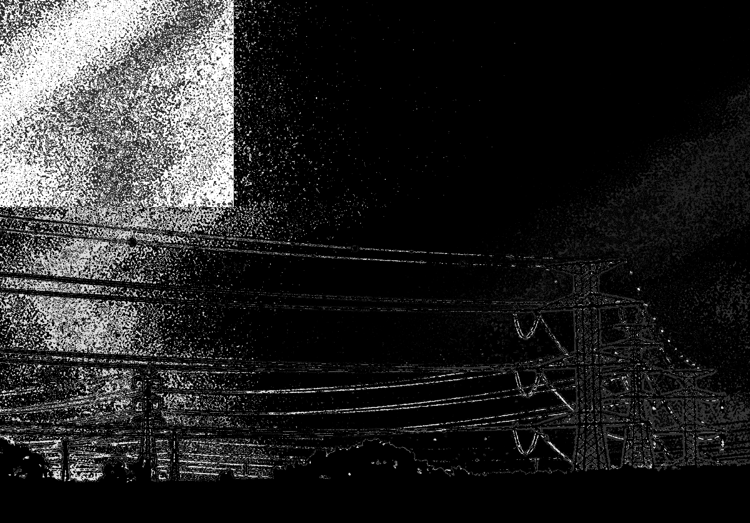
This once was my old profile picture, also my first time trying out CorelDraw (using a legal version from 1998 I think?). I, additionaly, added some shading to this badly vectorized boat, I rarely do that now.
"Dilema"
Pretty proud of this one. I was heavily trying out the tricks I could make with layers here. I was also trying out colours in this way for the first time, I used to make mono works only.
It's not like it's hard to use colours, no, I just had to learn to control them in this digital/abstract expressionist way.

"unsymmetrical nights"
Sick name, shitty work.
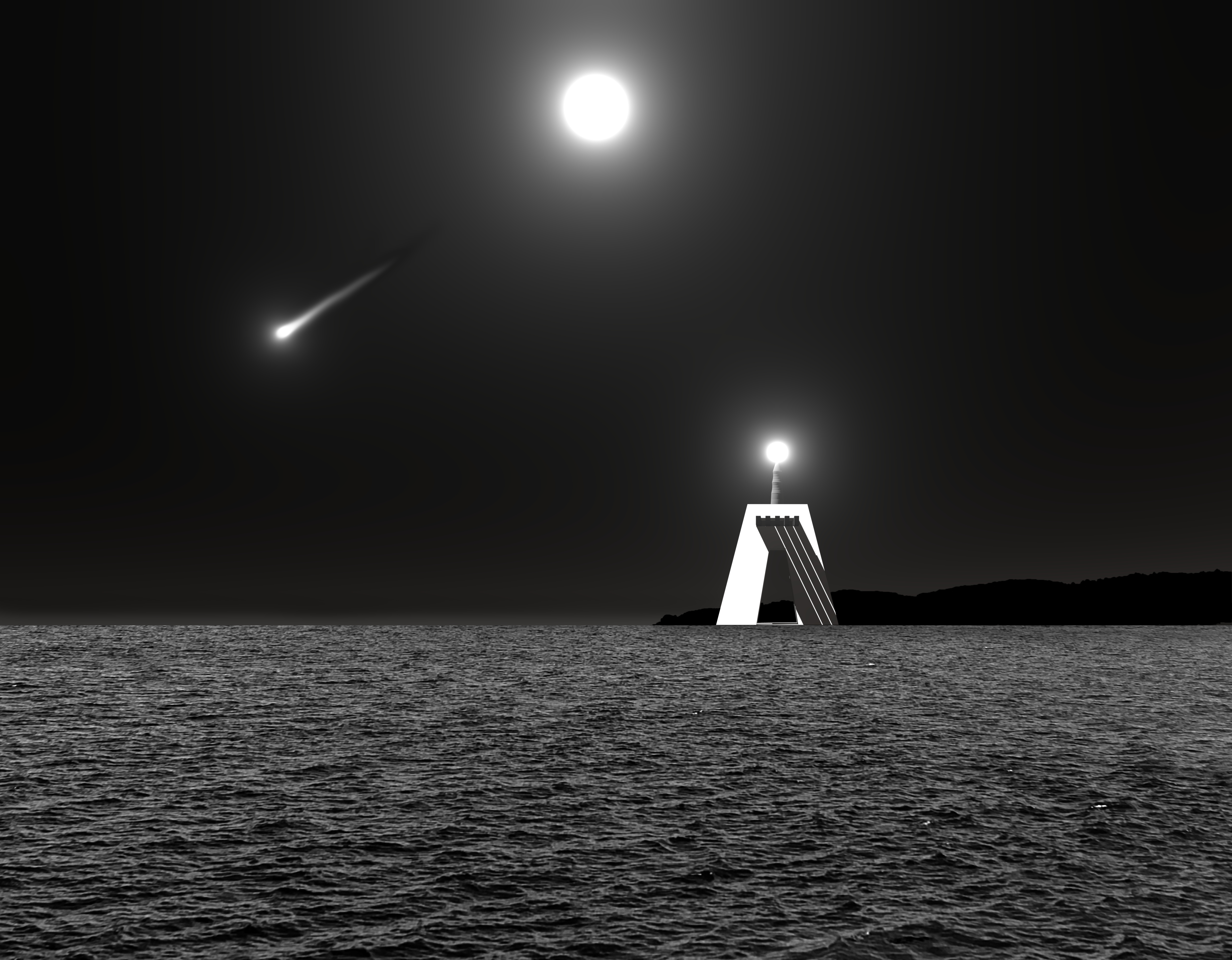
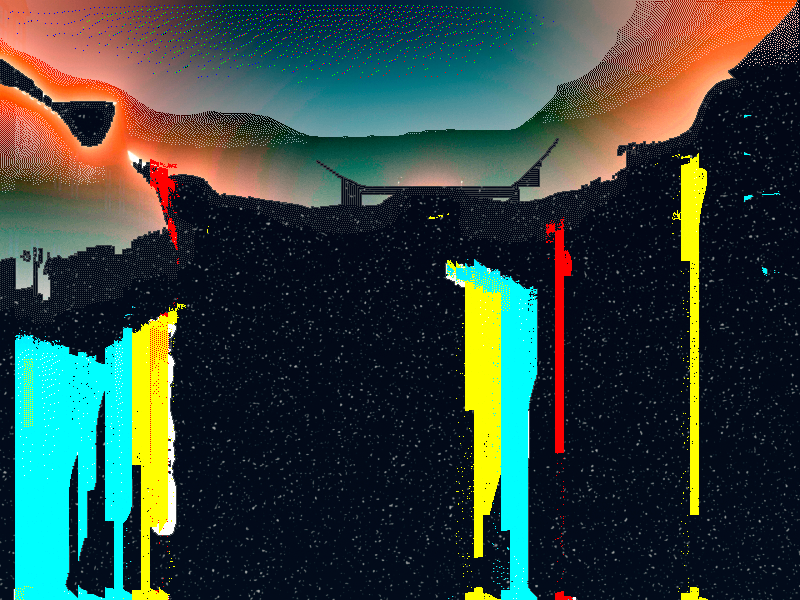
"Klaatu Fanart"
So theres this band I like: Klaatu. They are more """popular""" as the "Canadian Beatles". They were a three man band from the 70's-80's. Sadly, Terry Draper, the drummer, past away last year (May, 2025).
My favorite Klaatu album is "Hope", it's a beautiful 30-40 minute long masterpiece that follows the narrative of Politzania. Give it a listen, much of my writing in "Discursos - somos carne!" was inspired in that album.
Terry Draper made a sequel to their stories. The sequel album is called "Light Years Later", go listen to it NOW.
But yeah, this fanart is based in one of the artworks made for their band. I used blender for the lights, for the sky and for the lighthouse. The sea, the shore and the dragged light were made/edited in photoshop, based in photos that I took.
Klaatu's main page.
Klaatu's really sweet and wholesome Facebook Page.
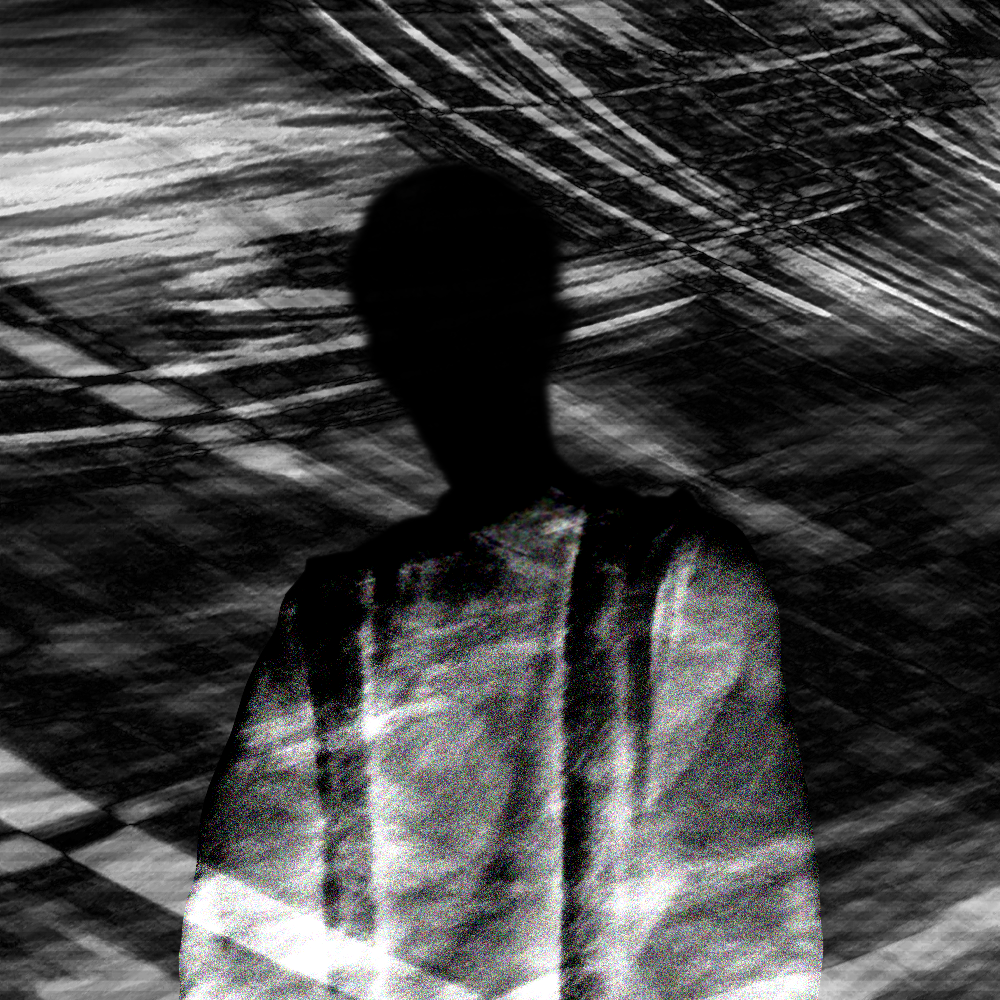
"Autoretrato" *("Self-portrait").
It's my first and only self-portrait (heyo that's me!). Jokes aside, I sometimes feel things, I assume you do too. These things flow.
When I posted this on my Insta page, someone commented "HOLY PEAK ZAYUM" - thank you.

"Coisas I - Mínimo" *("Things I - Minimum")
Yes, I do like Mark Rothko. No, this does not have anything to to do with his art (Besides the name, I guess).

"Coisas II - Coisas e tudo." *("Things II - Things and everything")

"Coisas III - As coisas não param." *("Things II - Things don't stop")
I really like this one. Out of all of the "Things" works, this is the first one were I didn't just try to present reality (or an element if it) but also show how I feel about it. When I made this, I felt frozen (maybe that explains the inverted colors in the middle picture), unable to change things, being forced to just face change (maybe that also explains why things are just crumbling down/kind of melting down, before me, in this picture). It's humbling to see how small and almost indiferent we are in a bigger perspective.

"Coisas IV - Perspetivas d'outros nas nossas." *("Things IV - Perspectives of others in our own.")
This work sucks. The idea is good, kind of a remaster of "Fédon" but still a good idea. But it just doesn't look good. It's overall a bad photoshop and I just don't like it.
Strangely, on my Insta, this is my most liked work of all the "Coisas" series wich makes me a little mad ngl. Like this is the worse of all of them and it's the most liked one?? Sure, it's like 3 likes cause I'm not really that popular but CMON!
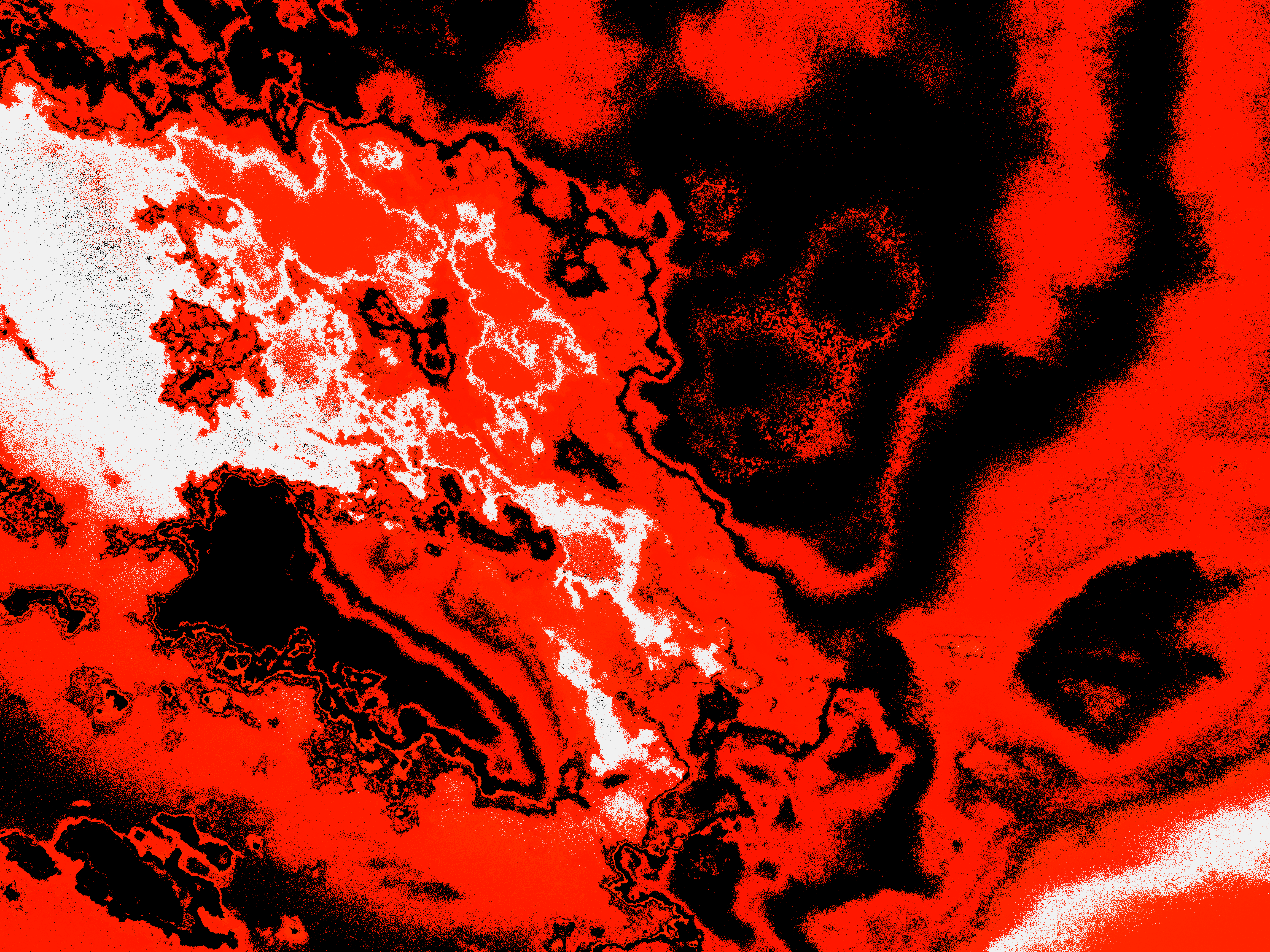
 RGB.png)
"Reset? RGB."
I don't really know how to feel about this one. I know this was made when I had the urge to cut off everyone from my life. I don't know if this is a summon of hope, a toxic and delusional belief, or a pretty work.
I love connection, I embrace it the most. The proof of it is my presence in the wired. But I also long for lonelyness? How does that work? I feel I want everything to be quiet, I yearn for it. Maybe my lifestyle is too much to handle, to much information to process everyday, and maybe I should detox. Idk.

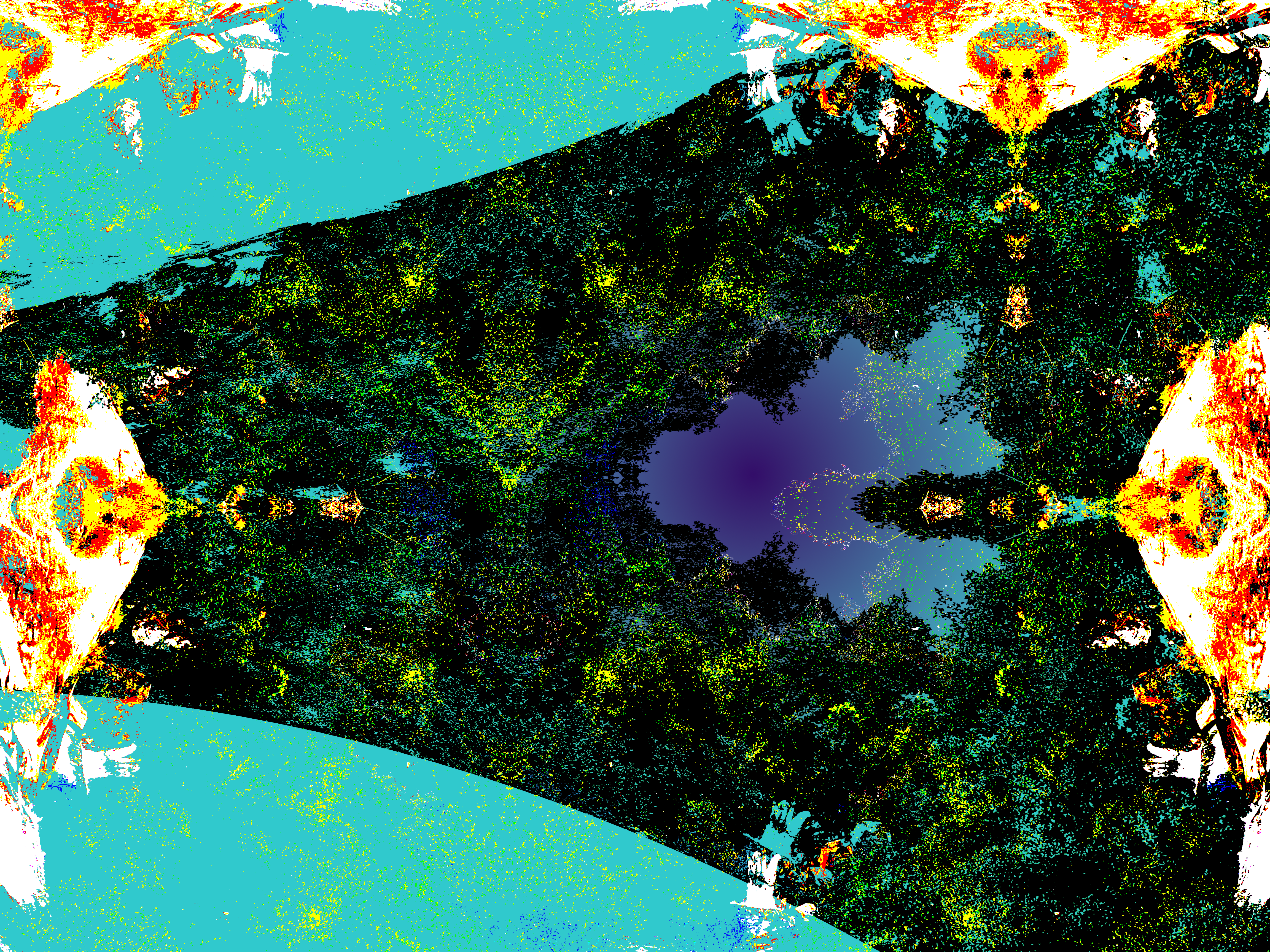
"Coisas V - It's going to happen, it's coming." *("Coisas" means "Things")
I believe this was just me predicting what was going to happen - the consequences of "Reset? RGB." - and how I somewhat felt about it.
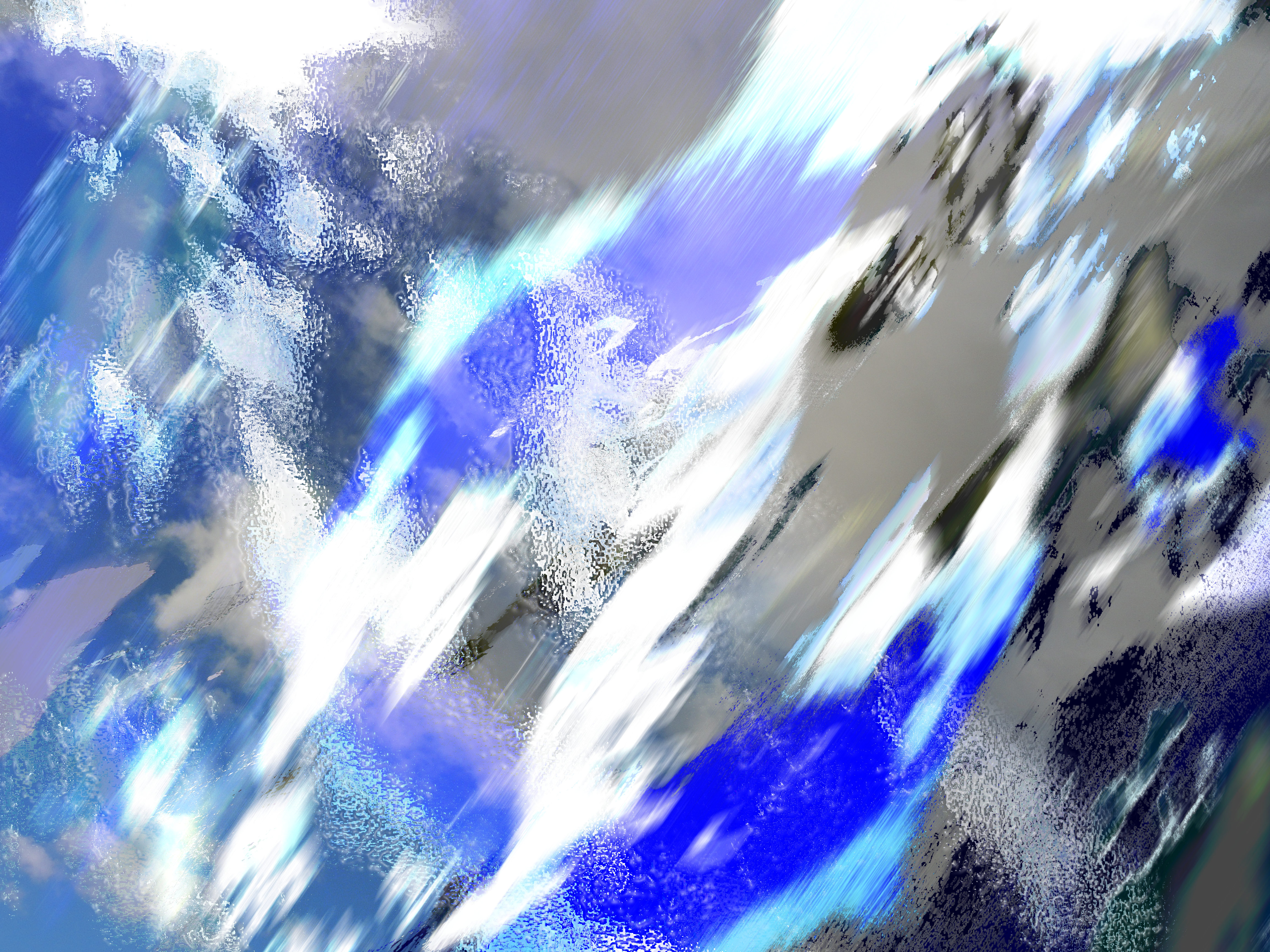
01
This is the first of the works that I featured in my short-film "Simulação" (From Discursos - O Fantasma). The ones after this "thing" are also from the movie. I'm presenting the ones that deserve attention. I'm not going to include the frame by frame animation of clouds from the movie (that is mixed with these pictures). If you want to know more about the movie project, go to the "Discursos - O Fantasma" project page.
02
These works generally portrait the fast passing of time, in a kinda of existencial way. This one helps with that, additionaly adding a certain feeling of emptyness. Even if experimental, it's a simple and easy work so let's not go to deep into this.
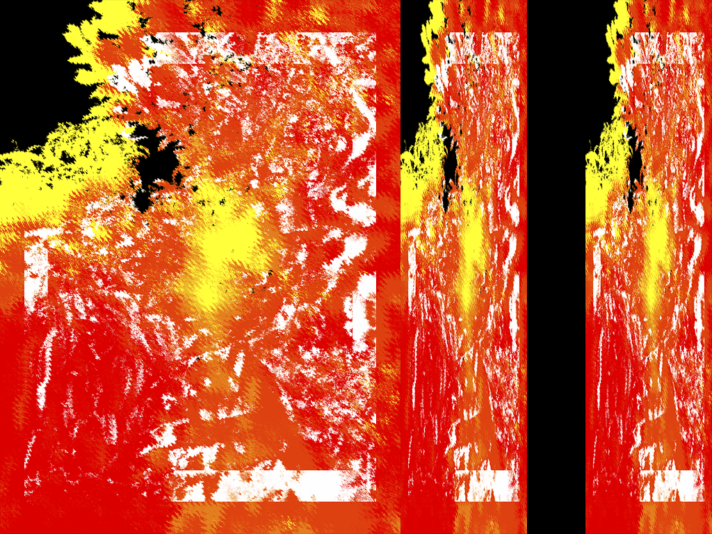
04
05
This one follows a similar technique of the previous work (04). But by just looking at it, I think I tried to apply subtraction to the layers? I'm not sure tho.
06
Oh boy am I proud of this one! Gives me frutiger aero vibes. I think I made this at the time when I was so into my own world that I just could not stop looking at things. I think one of the texts written on it says "It's pretty" - or something along those lines.
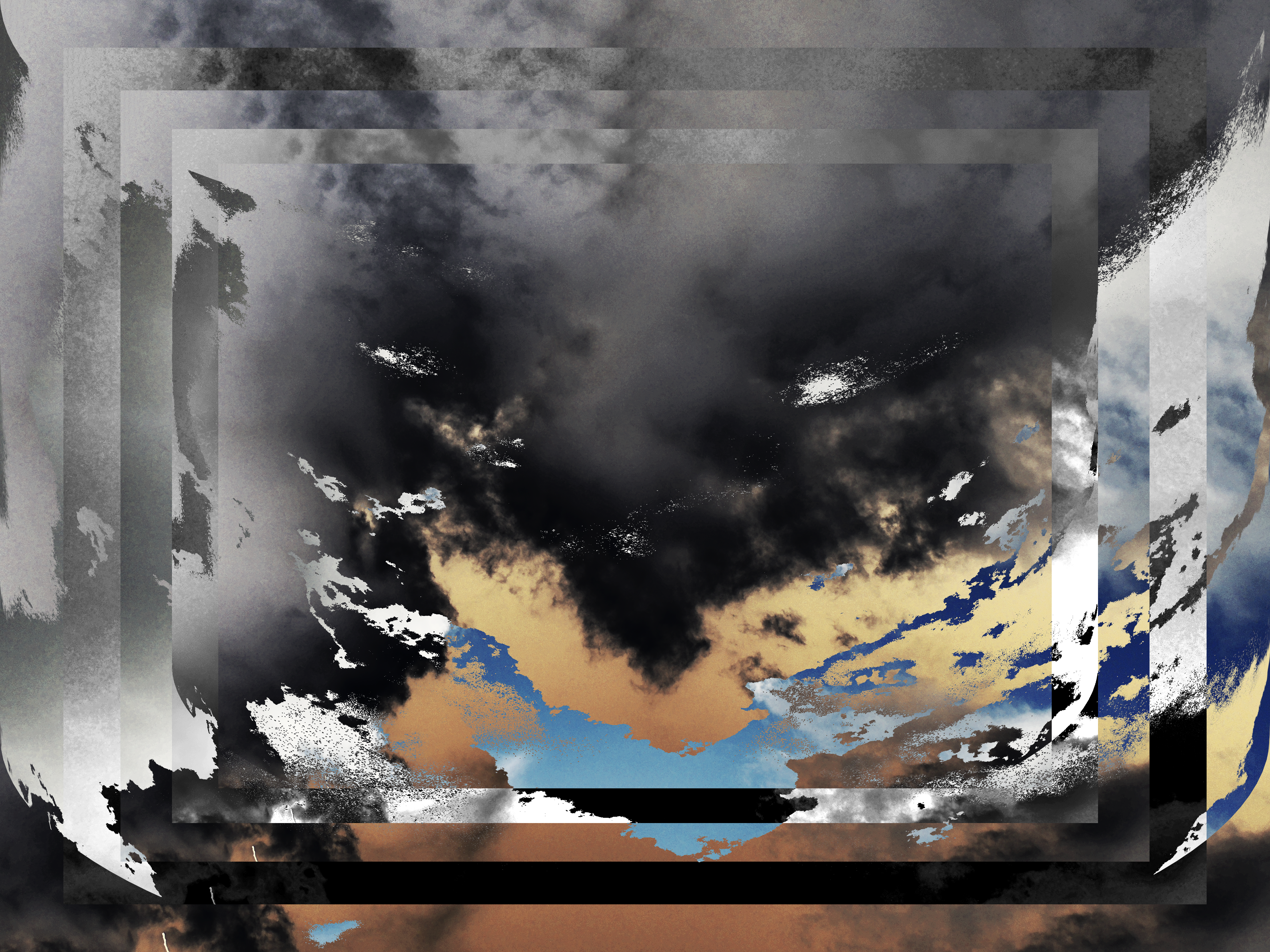
07
Well, this is such a pretty image. But so disturbing in the same time. Reminds me of "I Have No Mouth, and I Must Scream". Not because of the torture in the narrative, just because of the pure concept that the title of the book offers.
08
These edits keep getting more and more existential, in my opinion.
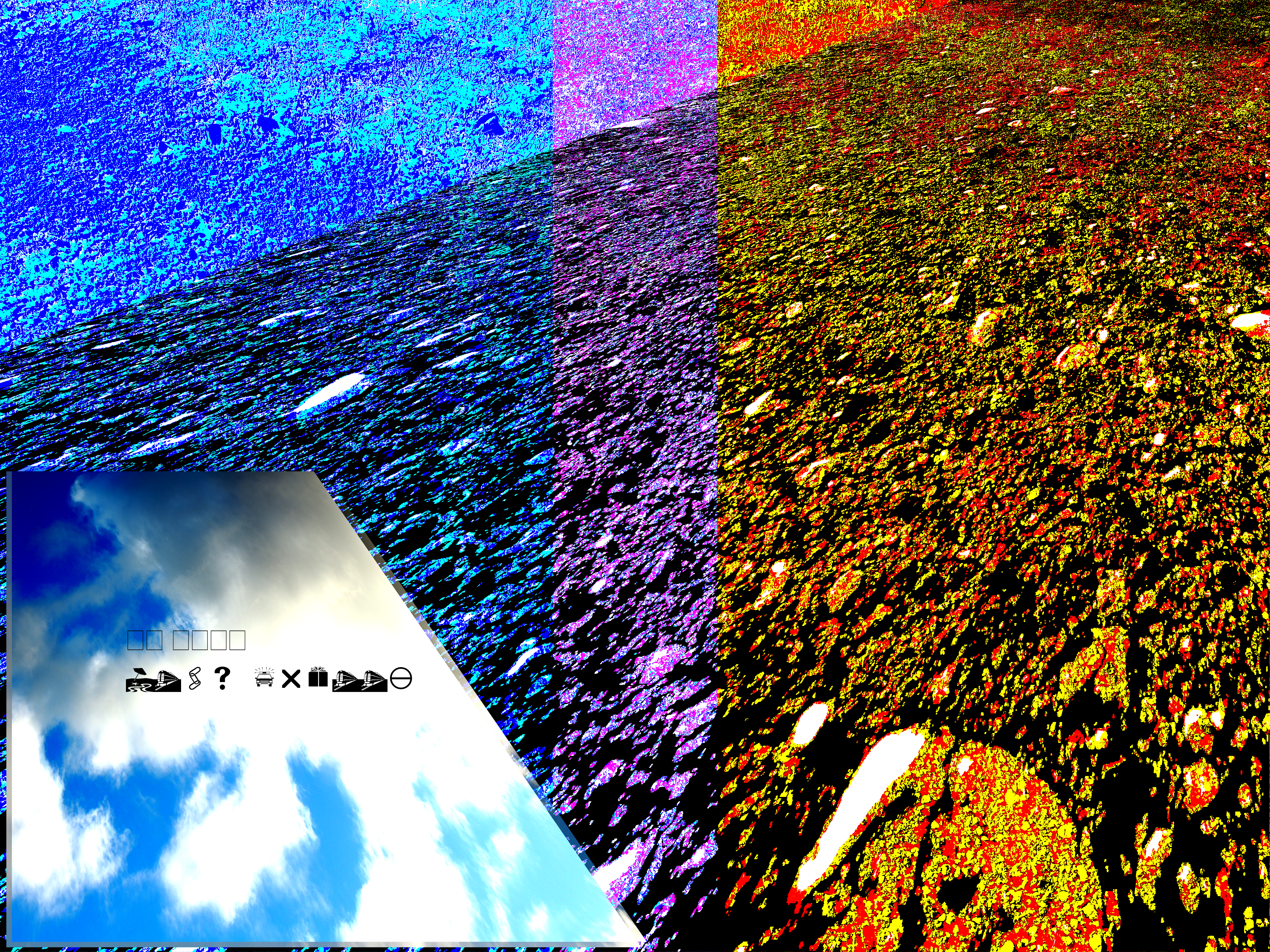
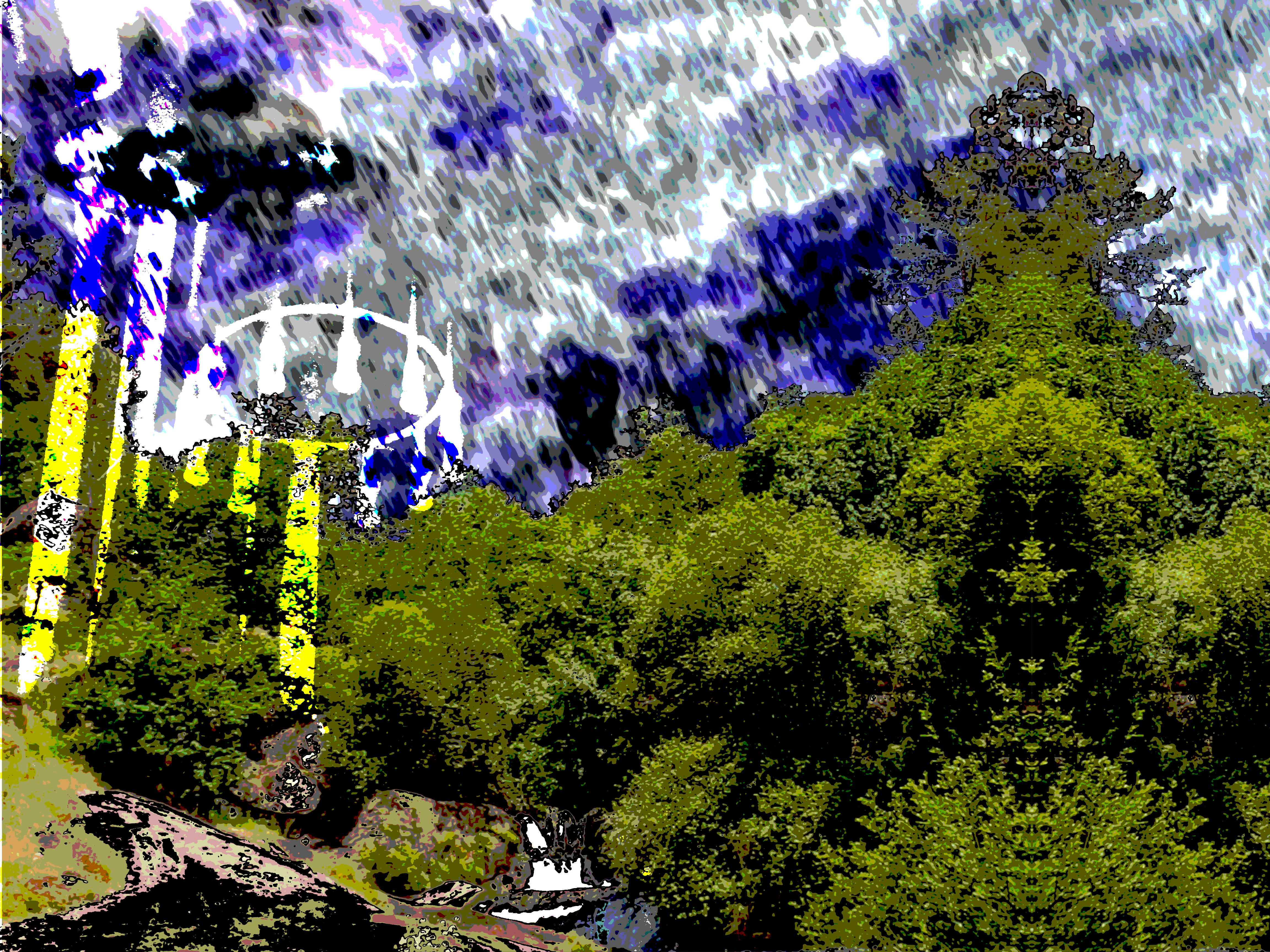
09
Made the circle thing with radial gradient, with the colors set to noise, I think. I'm also almost sure that the photos in this edit were taken in Galicia.
10
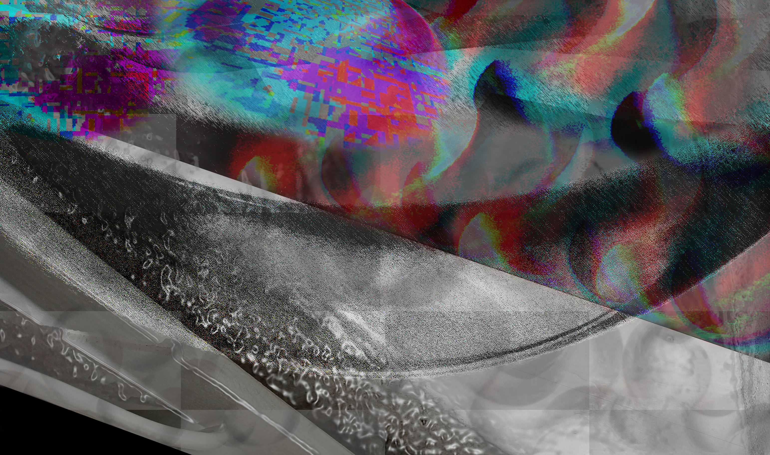
"Simulação" originaly was about nostalgia and getting away into a world of love and confort. I adapted this into the confrontation of reality when I made the film. So these frames are going to get more and more "glitchy" (because uhm... simulation) and more existential.
11
Yeah! I also edited the renders I made in Blender for the movie! And used them later for the "existential crisis" part. It's not me being lazy! It's me being canon! I'm serious dude!
12
14
Yeah, this is the "glitchy" stuff that I was talking about in the 10th frame.
18
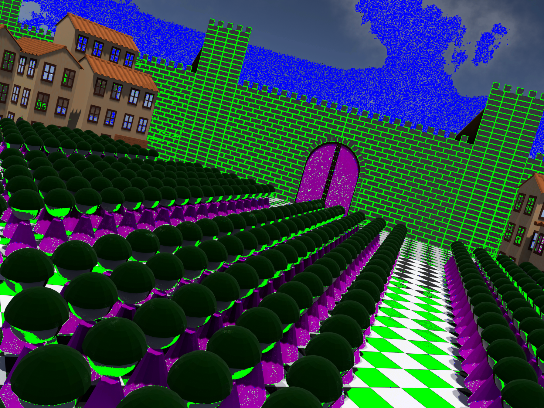
I started doing more mirrored stuff at the end of the production of the film. Please understand that I have changed alot just in the 1 year of the HUGE "Discursos - O Fantasma" project. So my """""artstyle""""" also suffered changes.
19
Ooooooo! Glitchy stuff again!
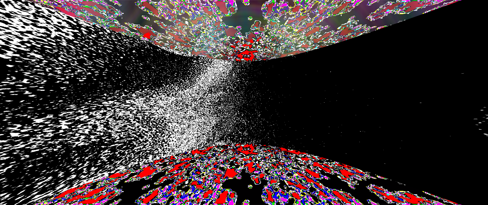
23
Funny enough, I "made" this with a filter in photopea (I was too lazy to open Photoshop, It's such a fucking slow program and Photopea does the same thing AND it's optimized) and I do not know how. So it was by accident, but man I had to use it. But the background night sky and the sunset like sky were made and rendered by me in Blender.
30
I drew that eye and, when I placed it in that specific position, it penetrated me. It feels deep. Idk, call me crazy. The original work is 31 but I made this version just because of that honest eye.
31
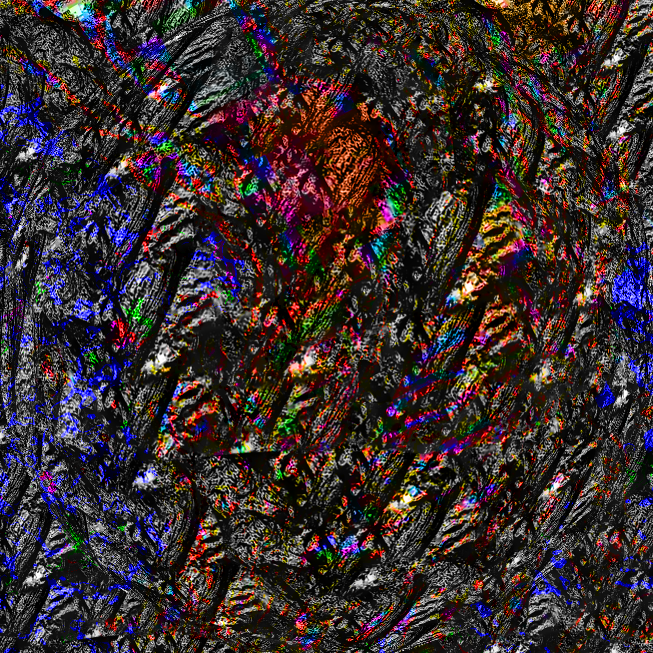
If you're wondering how I make these textures: I started using these textures by myself, no one taught me this (and I don't see many people making this type of stuff, only Jungle/Breakcore fans). So take this tip of mine: I take pictures of walls, depending on it's roughness. I also took photos of the texture of a tablet case when I was making the first part of the project "Discursos - O Fantasma". People think I'm crazy when I'm taking photos of stuff like that instead of taking photos of myself - and they're right in believing that lol - but it was necessary if I wanted to create these wacky textures that I could only use if I made them. I could've ripped textures online but I wanna make everything I make. I don't want to be some sort of a modern dadaist (even tho there is magic in being one), I wanna make almost 100% of the stuff that I make (the exception is my breakcore, that requires break samples).
If you want different textures, for example, more caotic ones, take pictures of dirt, not joking. You can also take photos of vegetation and then make different versions of thresholds, to somewhat simulate that caos. You gotta have the textures, and later you improvise, that's, for me, the beauty and the fun in making these things. I've taken photos of wood too. Almost anything works and you don't even need a good camera.
32
"Welcome to the family, your family." - No, this is not my family. This, if you understand this picture, is yourself and only for yourself. You belong there, sadly.
When making this, I had a major pain in the ass. The exported version was way ligther, I wanted it to be darker, just like my preview in Photoshop. And then I asked myself: "Could it be the resolution?" - It was a really large resolution so I tried to make it smaller, to see if it fixed the issue. Making it smaller made it to look the intended way. I think it was because this image has a lot of noise, a lot of mixed darks and whites. Maybe the preview simplifies the large resolution and makes the picture look darker because theres less white pixels. But when I export it, it will have the finished output, being with way more white pixels instead of the dark in beetween, making it lighter. So, in the original resolution, there were more white pixels than dark. But when I resized it to be smaller, it was cranked down, cranking down the whites while making the darks the majority instead? This is just a really long stretch of a teory (a GAME THEORY!) so idk. What do you think about this?
34
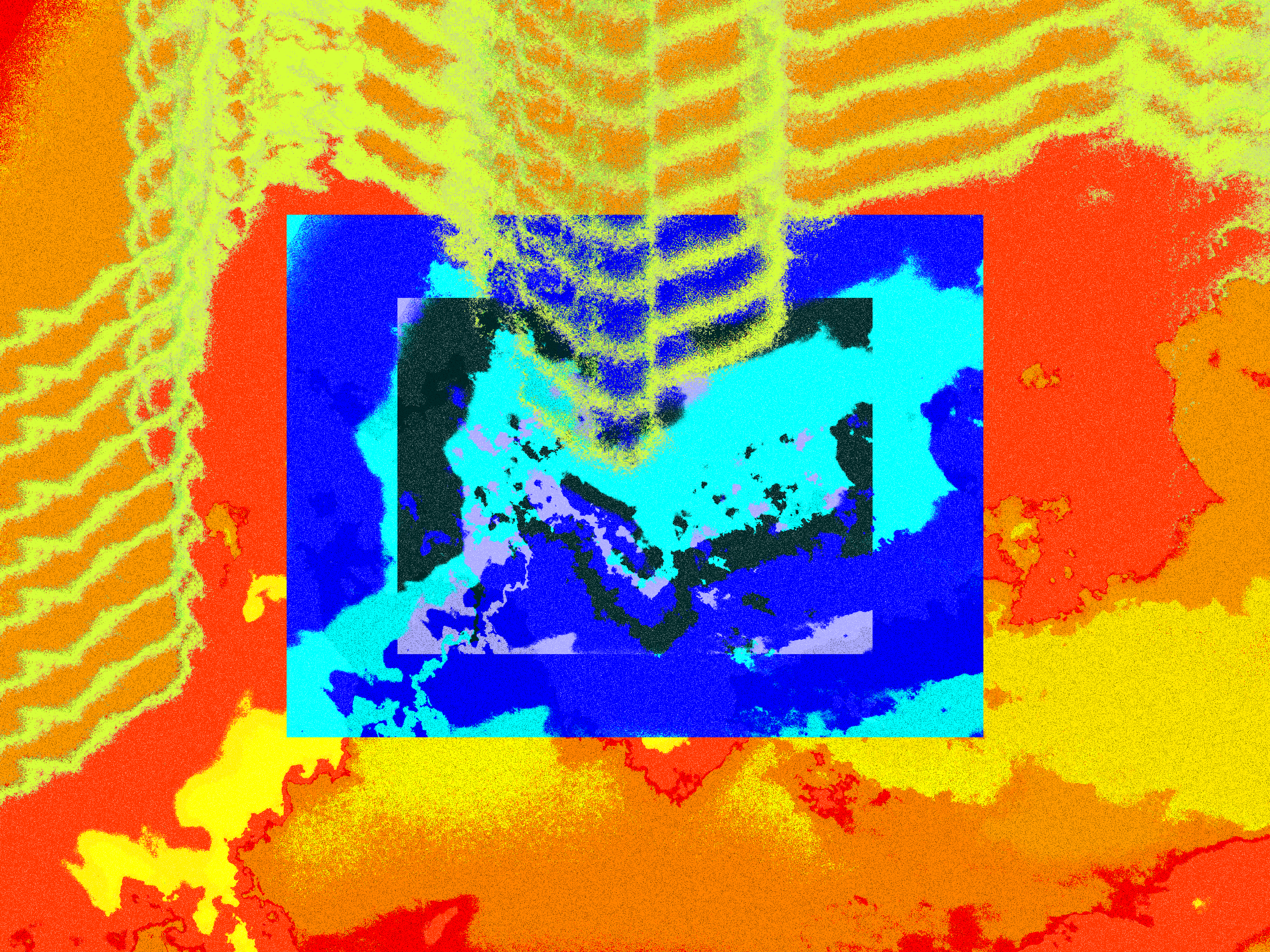
I made multiple versions of this frame, I think. It applies the mirrored stuff I already talked about. Also what the hell is this nonsense? Dreamcore slop??? (/j. I love dreamcore)
36
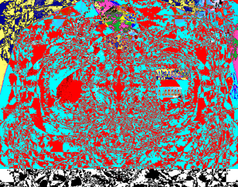
This one is kind of surreal. I can't imagine myself making this 1 year ago. It would've probably feel weird looking to me. These photos were taken in Spain and in the north of Portugal, near Galicia. The white chandelier is from a cathedral I no longer remember. I don't even know where I it was, probably Spain? 37 is based in the same photos from 37.
37
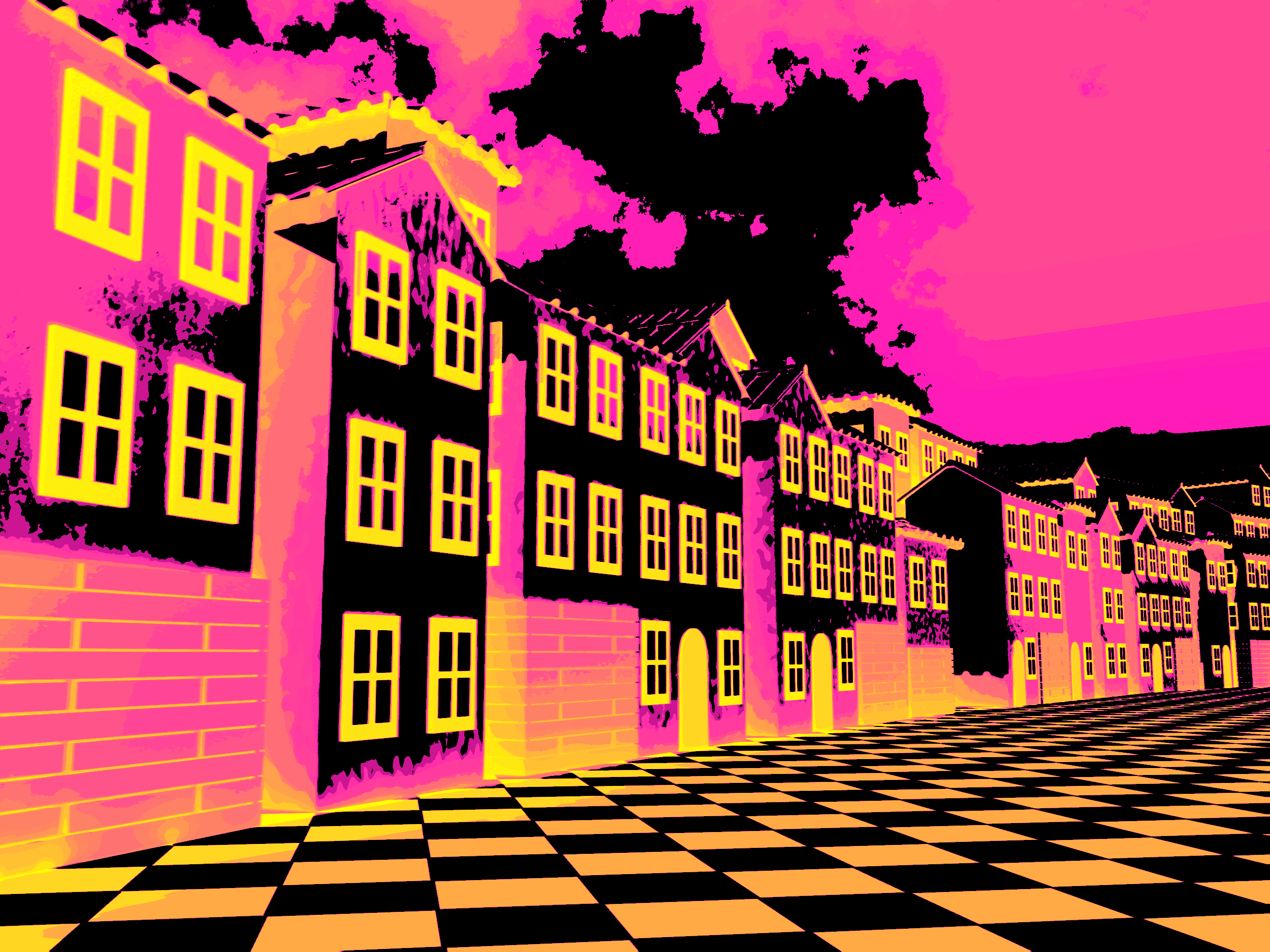
Wanna know how I made these James Pollock-ish lines? Get an image, posterize it for simpler selections, select one of the colours with the wand (preferably without the contiguous selection enabled), go to the select tab, make the selection more round and smooth if you want and then click the border option. There ya go! This looks complicated but trust me, compared to actually drawing, it takes way less time to learn. Sure, I've been doing photoshop stuff for around 5 years BUT what I learned over that time could've been taught in around 1/2 months. If you go, experimenting and improvising like I did, you'll learn, but not quickly. You're better off watching a YT tutorial, or reading a web guide, and then translating what you learned into a project of yours.
38
Yeah, I took mirrored stuff to the extreme here. But this isn't a really a exciting picture to talk about, pretty boring actually. Sooo... yeah...

You tell me what this is
Connected
452.8KB

it cuts out

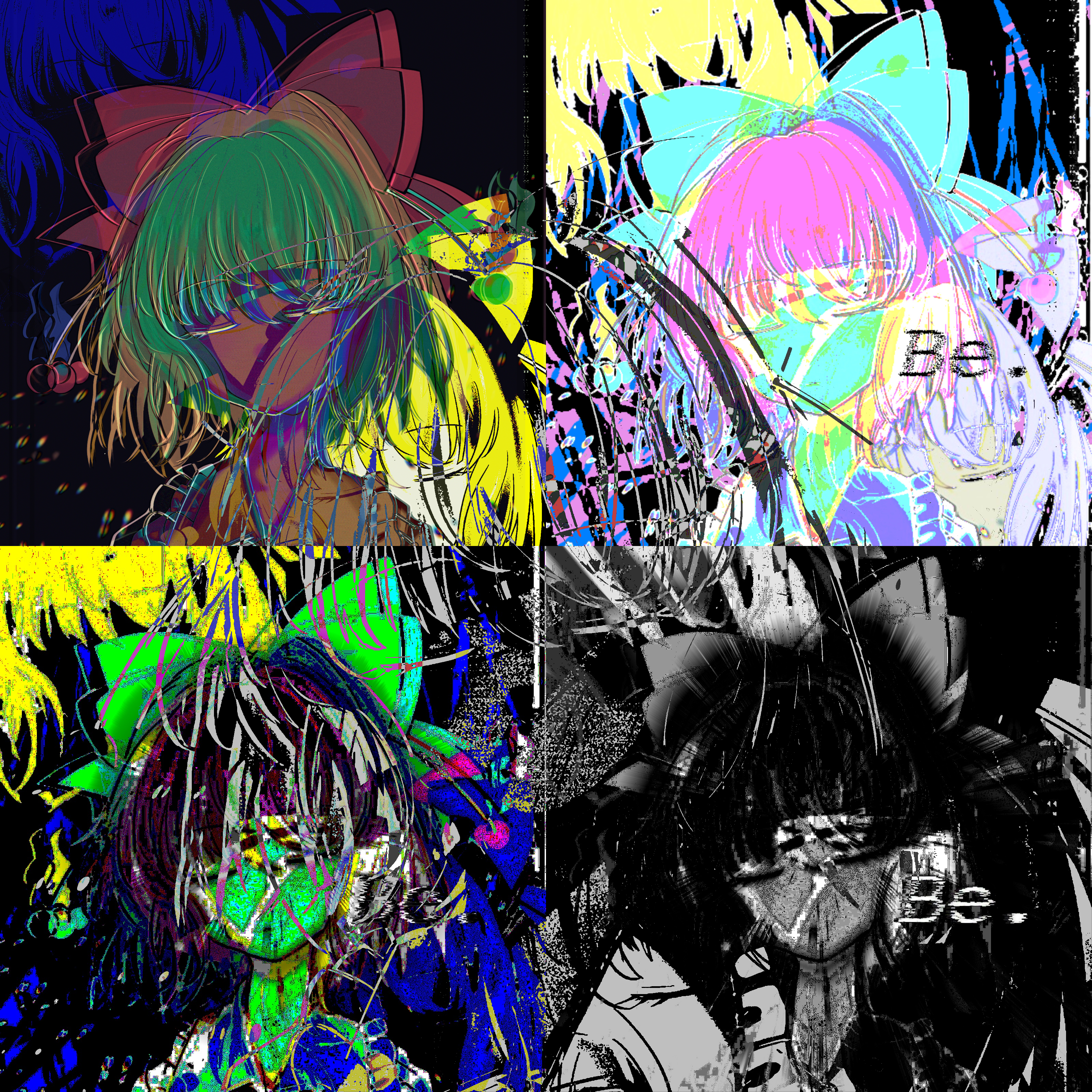
Rin Satsuki
Rin Satsuki - Be.
heusesai
STOPME

Rin Satsuki - Be - Corrupted as and in shit

Rin Satsuki - Be - All
Texts
notitle
NO TITLE - MANJAR
The inexistence of Rin
Oh! You've reached rock bottom, how sad you are! Nah, but actually, thank you for browsing through my gallery, it means alot. I'll keep updating this gallery everytime I make something new!